How and when to use select boxes in your UI
Select boxes are one of the most daunting elements to use on the Web. When does it makes sense to use them and when should we avoid them?
As user interface designers, we often ask ourselves, why certain elements are good or bad for a particular purpose. In this series of mini-articles, I will try to find answers to these questions. Let’s start with select boxes.
A “select box” (or a pulldown menu) in UI design has a particular problem, which everyone seems to forget about: they were not meant to store and display more than a few items at a time. This is because of poor accessibility and slightly different implementation by various operating systems.
Here, I have some examples of incorrect select box usage, along with an alternative implementation of the concept behind it.
1. Country, language and other long lists.
These are obvious. Due to a sheer volume of items contained and problems with accessing them in our user interfaces, a better option would be to use a new HTML5 hybrid of “select box” and “input” field: datalist element.

Since this feature is fairly fresh in HTML5, and not even supported in some browser versions (I’m looking at you, Safari!), I recommend a very good alternative: a jQuery plugin selectToAutocomplete, developed by Baymard Institute. Be sure to check out the demo!
2. Yes/No questions.
Indeed, the select box seems perfect for this type of query, but is it really? It’s easy to style and work with, but when it comes to usability there is a better alternative: “radio button”.
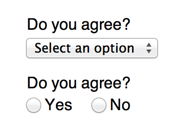
To minimise cognitive load on the user, radio button has two big advantages: user sees the correct answer before any action is taken, and the action can be taken instantly, with just a single click.
From my personal observations you should be safe with select boxes, by keeping the number of options below 10.
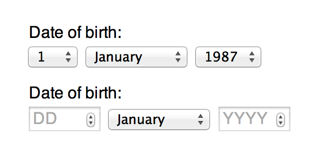
3. A long list of numbers (day/year of birth, etc).
This is a very common UX faux pas. Why force users to select from a long list of numbers, while you can let them type them into an input box? It’s generally faster and with appropriate validation, much less prone to a user error.
4. Menus and navigation.
Along with responsive design came a trend to use select boxes as navigation containers. The purpose was simple and easy to understand: select boxes are native elements, with pulldown effect and are easy to build. Except, they’re not as easy and intuitive to use. On iOS and Android once a select box is opened, it displays a “wheel of choice” which a user has to scroll through and confirm the selection.
The ideal model would be, in which the user is able to make a decision within one click, but oftentimes there’s not enough space to display all navigation items at once.
To replace our former scenario (with a select box navigation) with something more usable, we can design the navigation using an unordered list of anchors and a single external actionable element (button or anchor) and attach JavaScript click/touch event to it which will show/hide our navigation on screen. In my opinion this a more semantic and usable way of approaching responsive navigation design for web interfaces.
<nav>
    <a id="nav-link">Menu</a>
    <ul id="nav-list">
        <li><a href="#">Link #1</a></li>
        <li><a href="#">Link #2</a></li>
        <li><a href="#">Link #3</a></li>
    </ul>
</nav>
Wrap Up
By now, you may ask what good are select boxes for? The answer is simple: for pretty much anything else, as long as the total number of available options isn’t intimidating. From my personal observations, you should be safe with select boxes, by keeping the number of options below 10.
This concludes my short guide to using select boxes. I hope it was easy enough to digest, but if you have any questions, or have a better alternative to my suggestions, feel free to leave a comment or find me on Twitter.